KidzSearch - Safe Search Engine     

   web | images | video | facts | wiki | news | games | kidztube | apps


   Related Content
    • typography apps
    • typography video tutorial
    • typography art example
    • typography pop art
    • typography fonts


Not Finding Your Answer?
Post It On KidzTalk Homework Help


   Report a search problem


COMPANY RESOURCES LINKS SOCIAL
contact us education daily journal home facebook
about us make us your default search kidztalk twitter  
terms/privacy blocking websites kidznet pinterest  
advertise teacher zone wiki    
media link to us learning sites    
business / api solutions add a site image search    
affiliate program kidzsearch apps kidztube    
play youtube on kidzsearch games    
  voice search music    
  report a problem cool facts    
  settings news    
    search help    


 mobile version

      Copyright 2005-2024 KidzSearch.com 
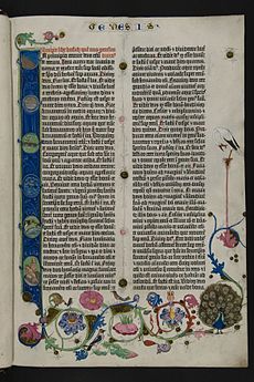
The Gutenberg Bible: exquisite at the level of page design, but the legibility of its type is poor. The influence of manuscripts is clear.
Traditional German typeface in a 1902 book. The pluses are its distinct national character and its historic origins; its minus is its poor legibility.
A striking 1921 cover design which echoes art deco.
One of many 20th century designs influenced by modernism and function: Eric Gill's Gill Sans typeface, 1928. The main advantage is its legibility.

Typography is the practical art of arranging how the printed word appears on the page. Typography was born when print was born. Early types were based on the letterforms of scribes, and the letters cut into Trajan's Column ("monumental inscriptions"). Later, gradually, type designs were based on the special needs of books, pamphlets, newspapers and advertisements.

 view more...


Pop Culture Typography

Pop Culture Typography
Bad typography has ruined more than just the Oscars

Bad typography has ruined more than just the Oscars
more videos...